We are part of the blog network and industry organisation Influencers of Sweden, and a while ago some of its members took a great initiative. Everyone who wanted to participate was assigned a blog to give constructive criticism on - and at the same time, they received constructive feedback on the blog from another blogger.
Feedback led to change
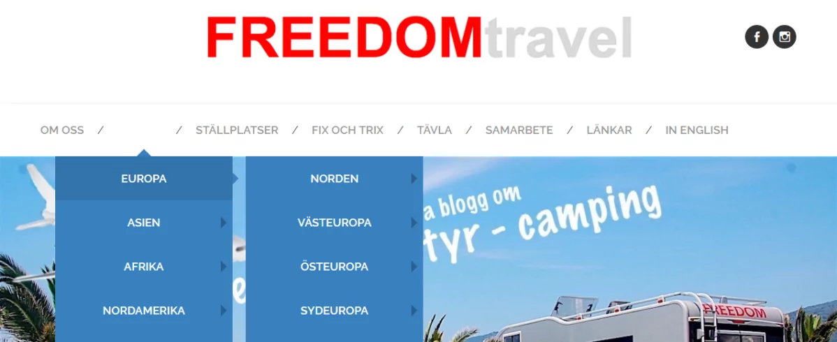
We received constructive criticism on our blog FREEDOMtravel from another blogger, which was both exciting and useful. What did we hear? Well, first we got a lot of positive criticism. Among the things that could be improved, the blogger in question thought that we should change the red colour on the menu and on the links, as she had a negative feeling about it and perceived it as a bit of a "stop sign".
We listened, of course, and have tried it out. If you look at the blog now, the theme colour is blue instead of red. The links are blue and if you move the arrow over the menu, you'll see that the menu bars that drop down are blue instead of red. What do you think? Did it get better?
More feedback on the blog
Both giving and receiving feedback was good! It's easy to become complacent, and it's much easier to see what others can do better and change. So now we wonder if you would like to help us and perhaps answer one or more of the following questions? Thank you very much for contributing your views!
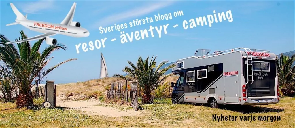
- What do you think about our header (the one shown below)? What does it tell you about the blog?
- What do you think about the appearance of the blog in general? Layout, style, colours?
- What do you think about readability? Size of letters, length of texts, headings?
- How do you feel about find on the blog? Is it easy or difficult to find information about destinations and other things?
- What do you think about content? The balance between factual and personal? What do you want to read more or less about?
- Do you have any more comments?







åsa in åsele says:
Interesting and rewarding with someone else's view and way of thinking, feedback is important, constructive criticism that makes you move forward.
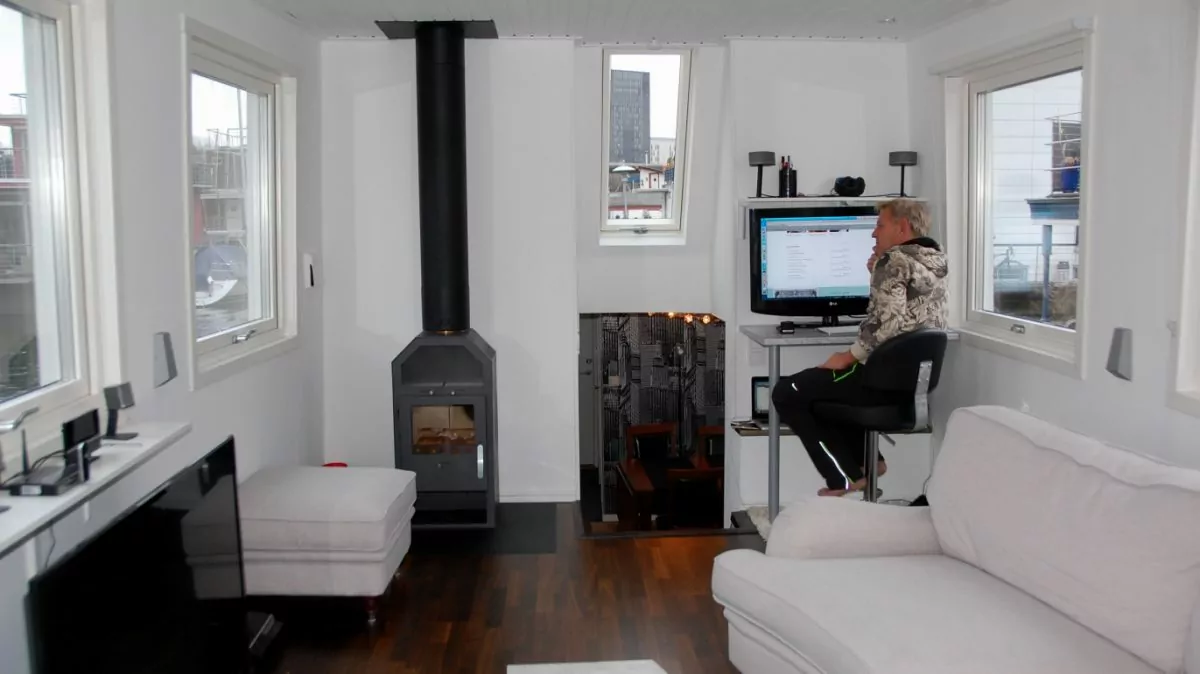
Firstly, I would like to say that I really like the picture of Peter in front of the computer in the houseboat, I like "at home" pictures which makes the blog more personal, as well as I absolutely love Peter's story of his life.
Your blog is different from other blogs I read/follow because you blog about experiences, travel, events and give tips on travelling,
I feel that you are serious and that you are honest in what you write about, that it is your opinion and that you stand for what you think.
The pictures on the blog are always of high quality.
<3
14 December 2016 - 7:30
Across the board says:
It became more readable with the blue colour. Sometimes I feel it is "too big" because both images and text are larger than on many other blogs and it is quite obvious because the comments are in a smaller size. On the other hand, it makes the post easier to read.
It's easy to navigate and I like the mix of personal and travel facts and it's not always easy to find that mix. It's easy for it to be one or the other, but I think you get it right. Then again, it's very difficult to satisfy all tastes - someone may only like exotic travel, someone else only the personal and the third is an inveterate motorhome fan. But you're doing a great job, so keep it up!
Hugs
14 December 2016 - 7:50
Mr Steve says:
Receiving and absorbing constructive criticism is an excellent way to bring about positive change... The change from red to blue is not something I've thought about, but it is certainly a softer reception with blue. But, if you also think this, why do you keep the red colour in the name FREEDOM? It doesn't bother me. Maybe it's meant to convey "STOP - stay here".
1. your header is very catchy and makes me curious. It conveys that you are everywhere in the travel world and that you are slightly more adventurous than the "ordinary" traveller.
2. I like the look of the blog, but I've also been getting to know it for a long time. The changes you have made in the past have been for the better. I simply enjoy FREEDOMtravel.
3. readability is excellent. You don't get lost in varying styles and colours, which I find merely annoying.
4. it has become increasingly easier to find through the link row in the header. However, I still have trouble finding previous/older posts. Any tips?
5. As for the content, it is extremely informative. You are charitably clear in your writing and have a good balance between factual and personal. You are liberatingly personal which I like very much as I feel I have got to "know you" in this way. It also makes me trust you.
6. Your photos are always of high quality.
I will come back if I have more comments.
At this point, I just want to reiterate that I am enjoying the company of FREEDOMtravel very much.
14 December 2016 - 8:25
Seija Viitamäki-Carlsson says:
First of all, my McAfee anti-virus software is deleting you. The site contains viruses and other things. I still click around and visit your site almost every day.
Reads everything, has read what is in the header. The appearance is normal. But it is the content that is interesting and coincides with my interests. I have become a little less curious now that the motorhome is in the garage and you are doing your job in a different way. I'm not interested in Christmas markets per se, but Helena's photos are always so nice, so I check anyway. I like your blog but miss the motorhome blog.
14 December 2016 - 9:52
Lena - good for the soul says:
Getting feedback is a gift. Of course you should get it from me too 🙂 .
1. Header - Very nice. Gives a nice feeling and shows a mix of content. Fun with the aeroplane. It makes you hooked.
2. appearance - Simple and clean. Always nice pictures.
3. readability - I think this is one of your strengths. Very clear and easy to read with preamble, headings, bold, and many links to previous or other posts.
4. Find - great with the menus.
5. content - A really nice mix of high and low, factual and personal. Another of your strengths!
6. other - You are extremely good at responding to my comments on your site and commenting on mine. It makes you feel seen and confirmed and valuable as a reader. Appreciated!
Hug Lena
14 December 2016 - 10:25
nils-åke says:
What do you think of our header: Shows what you want to convey?
What do you think of the general look of the blog? Clean and tidy
What do you think about readability? Good easy-to-read text
How do you think it is to find the blog? Easy menu not hard to find in
What do you think of the content? You are good at communicating about travelling and facts.
What do you want to read more or less about?: I think you have a good mix in your articles.
Do you have any other comments? Have been on your blog for a long time commenting would also like to say you give back.
14 December 2016 - 10:44
admin says:
Oh thank you so much!!! It's really valuable to receive comments and feedback in this way!
Åsa in Åsele, thank you for your nice comments that make us very happy! I can understand your point of view that it is nice to have pictures and stories that make the blog personal, I myself like that in other blogs. We'll keep that in mind! And, the continuation of Peter's story will come on Friday 😉 .
Across the board, thank you for your comments! Right now we're leaning towards keeping blue 😉 I hadn't realised that the comments are slightly smaller than the content text, but you're right! Of course, it is difficult to satisfy everyone with the content! Sometimes we have thought that it would be good to be more niche and write only about motorhome life, for example, but since we ourselves like to travel in more than one way, it feels most natural for us to mix ...
Steve, oh thank you for your nice, detailed and very positive comments that make us very happy! Yes, why do we keep the red colour in FREEDOM...? We probably thought of it as a logo, and you don't want to change a logo too often. But I know ... now the colour of the text does not match the colour of the logo anymore .... hmmm, difficult! We'll have to think about it... You can find older posts by going down to the footer. There you can either fill in the search box or search via "category" or "archive". But you might not think to scroll down to the footer to find this?
Seija, thank you very much for your comments! But wow, a virus? We haven't noticed that ourselves or heard from anyone else. But thanks for letting us know! We'll see if we can figure out what it is ...! I fully understand that for some people it is more interesting when we write about motorhome life, and it is a bit seasonal for us. But we have a lot of motorhome plans for the future! In February, we will be at the Caravan Fair in Kista and both report and lecture. And then we are planning a motorhome trip in the spring / summer (probably several shorter ones as well) ... 🙂 🙂
Lena, thank you for your time and feedback! Your positive words warm us up and make us very happy! I'm glad you appreciate that we respond to comments. For me/us, the exchange and "conversation" with blog readers and other bloggers has probably always been the most enjoyable part of blogging! 🙂
Nils-Åke, thank you so much for your comments and nice words! It is so much fun in the blog world with all the bloggers and blog readers that you actually get to know in a way. And sometimes there is also an opportunity to meet for real! 🙂
14 December 2016 - 10:50
Monet says:
I repeat what I said before: I miss the "magnification" option on your texts. I suffered from galloping cataracts and a severe visual impairment. I was still able to read the text with the help of magnifying glasses and the possibility to increase the size of the text, which you can do on almost everything on the internet. But not with you, where the size is as it is. Now I've had surgery and can see better again, but I couldn't enter your site for a long time, the text was simply too small for me. It is very useful to be "visually impaired" as badly as I was - only then do you realise what a handicap it is in everyday life. I am also not so amused by Christmas markets and also by countries where I cannot speak the language so Croatia as an example is lost on me. I mostly like the travel reports with Freedom and your fates and adventures there. Then I have worked in an advertising agency and of course have views based on that experience. I think the header is cluttered with a cut-in aeroplane, text on a slant, a sailboat that looks like it's in very shallow water and could drive up onto a sandy beach at any time, and a mixture of negative (white) and black text. You have wonderful pictures that you spoil us with. Plus your cool campervan which is really unlike any other. I would focus on that and refine it a bit. A tip is to avoid negative text - there is even research that shows that it is more difficult for the brain to interpret white text against a darker background. And it's even worse if there are subjects in the image. Otherwise, it is very fun and interesting to read here and especially you Helena, write very good Swedish! And I agree with those who think you are exemplary in responding to comments. THAT is a great advantage and very professional!
14 December 2016 - 11:43
Veiken says:
I like the blue colour much better. I have blue in my own blog for some reason! 😉
Otherwise, I have nothing to add, except that your pictures are super professional. Simply delicious. A small informative course for the rest of us in how you think photographically, may be an idea......
14 December 2016 - 12:42
Goatfish says:
Blue is calming. I have green and some blue in my blog.
Your header is informative, perfectly OK. And I like the rest of the layout. I think the text is easy to read. And as for the size, I magnify on the computer itself, because my eyesight is sensitive, so it works.
Super professional pictures and like them in large format. And fun to "look in" to you sometimes, you keep a professional style but still offer yourself privately, and it feels welcoming. Fun to follow your travels on my screen 😀.
I like to get feedback on my comments with you 😉 it's always a matter of interaction, to get readers 😉.
Good mash, as they say here in Lisch 😀.
14 December 2016 - 12:50
admin says:
Monet, thank you very much for your comments! I am fully aware that you appreciated the previous theme, where you could "pinch and drag" on your mobile phone. Now we have a more modern theme that is mobile-friendly, so that's not possible. But you can enlarge the text on your own computer/tablet/mobile phone? Thank you for your wise comments on the header! I will discuss the sailboat and the text with Peter. We added the airplane after many people (readers and potential partners) told us that since we "only travel by motorhome", our blog is not for them ... We travel BOTH by motorhome and in other ways and like both, but communicating this is a challenge we have realised ... 😉 .
Veiken, thank you for your comment on the colour! It feels like we'll keep it 😉 Glad you like our pictures and oh, we'll have to think about that photography course ... 😉.
Geddfish, it sounds more and more like we should keep blue as a colour! 🙂 Thank you for your feedback and nice that you perceive the blog as both professional and personal, that's exactly how we want it to be perceived 🙂.
14 December 2016 - 12:59
Britt-Marie Lundgren says:
I think your blog is an example on three points in particular;
- Professional images, which we appreciate.
- The blog is written in very good Swedish.
- It is easy to find the "history" if we have a sudden interest in a particular destination you have written about in the past.
The mix of travelling and everyday life is also nice to see.
I think the idea of a blog for constructive criticism between bloggers is very good. It's so easy to become complacent and follow the same old path when small simple changes can make everything so much better.
By the way, your early morning posts can continue to brighten up my commute to work!
14 December 2016 - 14:03
BP says:
Actually, I could have copied Steve's comment, because I completely agree with him - except for the header. Here I share Monet's opinion. He*s obviously as professionally damaged as me;-) The header is the only thing in your otherwise professional blog that I don't like.
If you want to convey different ways of travelling, I would make a collage: picture taken from an airplane, boat/beach and Freedom of course. Then I would put the text under the three (or four) photos. Put about six pixels between the photos (6 pixels). FREEDOMtravel on top of course. Slanted text inside an image is never a hit, as well as mixed fonts.
Appearance
You have many older readers, so the larger text is perfect, as are the headings. Clean look, excellent readability.
I think it is easy to find your blog.
Content. The only "really" personal thing on your blog is really "only" Peter's "Happy Friday - This is my life", which really attracts a lot of readers and great comments. I wonder what the "successor" will be ...
Many guest bloggers tend to write far too long posts in relation to the number of photos. Give bloggers a maximum number of characters and ask for more photos.
I rarely read "comment threads", but with you I do. Incredibly professional how you respond to comments. Always a personal touch and answers to any questions. Exemplary I must say.
I have been reading your blog for years. Would probably not continue with it if I did not enjoy it with you. I love your blog:-)
PS. I guess you chose red menus before because your logo is red. Have not thought about it either. Blue is perfectly fine and slightly calmer;-) DS.
14 December 2016 - 16:23
Ruth in Virginia says:
Very nice picture of Peter "at home". I like the little personal touch you
posts from time to time; makes me feel, like we are familiar. 🙂
Like to get feedback on comments.
I read your blog every morning; wondering "What will it be today?"
I think it's fantastic that you write every day. I have nothing
interest in motorhomes - you know how I feel about them. 🙂
I skip the parking spaces and the like. You don't have to read everything.
Your photos are prefessional; a delight to look at.
Regarding the header - it IS plodding. No satisfactory collage. FREEDOM stands there at a gate opening.
in an ugly old fence. The ground: neither sand nor grass.
Makes me think of a family in a small town in Nevada....
asked how they came to live there. "Well, our
trailer broke down, and we couldn´t afford to fix it."
Suggest you bypass palm trees and sandy beaches - please!
14 December 2016 - 17:44
admin says:
Britt-Marie, thanks for the great feedback! Really positive and encouraging to hear that! 🙂
BP, oh thank you so much for your honest and good comments! Now several people have commented on the header, which of course makes us start thinking about it. Yes, it is important for us to communicate several different ways of travelling! We could think about collage. Do you know of a good (free) programme to do that? InDesign and stuff like that requires a subscription nowadays and I'm trying to avoid monthly expenses... Or is it perhaps smarter to ask a knowledgeable person (for a fee of course, even though we may not have a huge budget)...? Good thoughts by the way about the guests, but we will stop (or pause?) after Christmas, so it's not the time to change 😉.
Ruth in Virginia, thank you too for your great and honest comments! It's so nice to hear that you like our blog and want to come back 🙂 We've had some feedback on the header now, so we're starting to think about it. When several people write the same thing, we of course take it to heart! Thank you very much for that, it was exactly the kind of feedback we wanted! 🙂
14 December 2016 - 18:30
Husis blog says:
My owners do not have much experience with this so it is difficult to say plus and especially minus.
But they like your personal approach to writing. Getting the reader interested in your text, which you do very well. I now follow your blog every evening and find your travel stories interesting.
I like the layout of the page and that you comment on each image with less text, it is clear.
Something that is also appreciated by you is to get feedback on what you write and the owner has tried to emulate my blog.
It was actually you who got the owner to start blogging as he thought your post from Elmia was interesting as you gathered some bloggers on one of the evenings.
14 December 2016 - 19:14
Rantamor on the retina says:
I have always liked what I have read and been served here with you, sometimes I just read and sometimes I comment.
I don't comment every time because I really want to say something, not just write a comment for the sake of it.
Nothing should feel forced when it comes to blogging, I think.
Every day is different for all of us.
I've been criticised that I sometimes feel like a blog break, that I don't comment every day.
But blogging should be free and joyful.
Sometimes illness has prevented me, sometimes I just haven't had the energy to wander around on blogs I otherwise like so much.
But that's me.
I think you have received so many tips about your blog so I will not write anything other than that I like your blog, and like Ruth, I always look forward to new adventures and like to follow your travels.
Tjingelingen from Rantamor.
And one thing your houseboat seems very spacious and cosy.
Stuff.
14 December 2016 - 19:37
Elisabeth says:
I like your blog and have been following it for a long time. I think the header is messy and the white text, I would skip. The blue colour is more restful to the eye than the red, but the eye is drawn to the combination of blue and red. Started following you from the motorhome perspective, but also enjoy reading about other trips. Always fun to get tips on different sights, dishes, etc. The text size is good and the pictures are nice. Today's picture with Peter's workplace is very nice. Hugs
14 December 2016 - 19:53
OnTrip.com says:
You have a beautiful blog and I would be so boring not to answer all 5 questions. I will, however, give you lots of praise. I enjoy following your blog, reading about your life where you are also so open to share much of your private life. I especially like your new look.
It seemed clear, clean and easy to read.
Keep up the good work, because no doubt - I'm watching 😉.
/Annette
14 December 2016 - 20:20
admin says:
Husisblogg, oh, it's fantastic to hear that we inspired you to start blogging! Best criticism you can get 🙂
Rantamor, commenting is certainly not a requirement and should definitely not be! I agree that blogging should be because you want to! We really appreciate all the comments we get here, but we also appreciate all our silent readers 🙂 Funny that you follow us and always fun when you write!
Elisabeth, thank you for your kind words and good comments! We've got some new thoughts and ideas about the header so we'll probably change it eventually, although it might take some time until we get around to it,
Ontripdk, thank you for nice words, it warms! So fun that you follow 🙂
14 December 2016 - 20:37
Matts Torebring says:
I like your commitment. You write objective and factual posts and also write every day. I admire you for answering and commenting on almost all of them. Sometimes I can't believe you have the energy and time to do it. I read somewhere a few days ago, "The more minimalist and simple you write, the more visitors you have"! I take exception to that. Sometimes you may have a lot of text, but then I skim.
I think you have a good balance with pictures. When a post is drowning in pictures, I get tired before I get to the end. You also always have very nice pictures.
As I have written before, you are professional and do everything right.
14 December 2016 - 20:44
BP says:
Answer: You see, I read your comment thread;-)
I don't know much about free programmes, unfortunately, but I know that Paint is one that many bloggers do wonders with/in. However, I don't know the programme.
But I assume that you use a photo editing programme - Photoshop/Photoshop Elements perhaps. There you should be able to do all the things you are thinking about. At least I do it in my blog, which is much less professional than yours and not the same genre either. Photoshop Elements costs SEK 599 at Dustin right now.
I think it's a bit funny - we disabled people and Ruth (who has great views and is so wonderfully straightforward - love that woman) don't like the header, while others like it a lot. Sometimes you can wonder how important a header really is. You notice this when you have posted a new header and no one comments on it... Then you almost become "sad" if you say so.
I think that partners (and we professionals) pay much more attention to the header than your "regular" readers do.
Now that I have read more comments, I can only agree to praise the use of language with you, not only with you Helena ("nobody is perfect", but you are (have never seen a spelling mistake in your posts - professional injury again ...), but also with Peter who has "IT" when it comes to writing personally and with a twinkle in the eye. He is somehow "bolder" and more forward if you know what I mean. You complement each other perfectly!)
PS. Not a bad idea to have a "professional" look at the header, but if you have PS Elements you should be able to do it yourself. Otherwise you can always ask me;-) DS.
14 December 2016 - 22:07
admin says:
Matts, I don't know how we find the time sometimes ... I often read and respond to comments with my mobile phone when I'm travelling by bus to and from work, for example 😉 It may be true that some of our posts are too long. One of the reasons for many headings is actually to make it easier for those who want to skim the text and perhaps jump to the paragraph they are interested in. Thank you very much for your comments!
BP, haha I see! If you look in and read this too, I will be impressed 🙂 We are a little flattered that you think we use an image editing programme, we do not. We edit a little bit, but only using what is in the basic package in the computer, in my case (PC) I use Microsoft Office 10 for simple edits. 599 was a reasonably ok price actually, thanks for the tip! However, we have now found a free programme that we think we can use, namely "Canva". We have taken inspiration from what you wrote about collage with three pictures and will try to make something. So thank you for your help already! We'll see if we need to come back 🙂 Many thanks for your nice comments about our texts too! Yes, we are aware that we have a slightly different style, and you describe it very clearly 🙂 .
15 December 2016 - 6:58
The travel dream says:
Gimp is a good image editing programme, which is free.
http://the-gimp.sv.softonic.com/ The programme can be described as an advanced image editing programme that allows you to do many of the things you might typically look for in Photoshop.
15 December 2016 - 11:42
Biggeros says:
Do I need to find something wrong? Unfortunately, I do not. I find that information is factual and images are clear. I find what I want to find easily. The headline is enticing and subtitles are the perfect size and format. What more can I say...you are a great travel blog???
Such a cosy interior in your houseboat. Would like to see more of it. Hugs
15 December 2016 - 14:08
Discovering The Planet says:
So great to get feedback from readers. Do your readers want to go in and think about mine too 😉 🙂 🙂 .
I agree with most people here above. You follow you both because you are personal, have good pictures, and good info. Regardless of the header, you have your followers anyway :).
15 December 2016 - 14:26
Christine - 29°. says:
So fun and exciting with feedback. I think like Daniella, follow you because you are personal, lovely and give good info. You have a fantastic blog!
As for the blue colour on the menu instead of red... well, I would have kept the red. This is very much a matter of taste. But regardless, I don't think you should abandon "your" red colour completely on the blog. Besides being your colour (the logo), red is also the colour that the eye first perceives. So if you want to be clear, or for someone to notice something extra much, or if you want your brand to be visible extra well, then red is the colour to choose. (If you think about it when you watch films from now on, you will see that the people that the viewer should notice often wear red 😉 ).
15 December 2016 - 15:49
Helena says:
I think the header text also screams stop with the bright red colour. Personally, I would try to change it as well, perhaps in a similar colour as the menu. Or just another shade of red if you don't want to change completely.
I also think the header itself is very large, it takes up too much of the screen for me so I can't even see the beginning of any post. And then I have a very large screen. Haven't checked what it looks like on my laptop. Would also move the two badges (how to say that word...).
And finally, I would like a centred menu. It feels like something is missing in the right corner. And reduce the preview image so that it is the same size as the post itself. Yes, those were my little opinions 🙂 Otherwise, I think the text and content are great.
15 December 2016 - 17:51
admin says:
The dream of travelling, thank you so much for the tips!
Biggeros, oh thank you for the nice words!!! We appreciate both positive comments and constructive criticism 🙂.
Discovering the planet, feedback is great! It is easier to see what others can do better than what you can do yourself... So glad we asked 🙂 Of course, you can't satisfy everyone's wishes, but we have received several good ideas that we have started to think about (perhaps especially the header then because many have had comments on it).
Christine, thank you so much for your comment and feedback! It's great (and fun!) to know what you do well and what others like too. Interesting that you like the red ... now that so many people have said they prefer blue. As you say, it's very much a matter of taste. Obviously, red evokes certain emotions, so the question is whether it's for good or bad ...
Helena, thank you very much for your comments! It has been very interesting with the colour red, which many people seem to have opinions and feelings about. It was quite easy to change the theme colour. Changing the logo itself feels a little trickier when you have worked in it for a while and printed business cards, roll-ups, etc... Not easy like this 😉 Your comment on the non-centred menu I am super curious about! On my home computer, my work computer and on Peter's computer it is completely centred. So what does it actually look like on yours (curious)... and why might it be different (if I didn't misunderstand your comment)? Or, now that I looked more carefully, I see that it might be a centimetre different, is that what you mean? I don't know how to fix that, but it might be possible to find out ...
15 December 2016 - 21:50
steel city anna says:
Wow, it was worth what there was a lot to say when you read the comments at least 🙂 haha, yes I think it's your blog so what you like we get to like or deal with like?! The only criticism I have is that your blog is a bit heavy to load sometimes on the mobile phone - and as a travel blog, maybe many people want to read it when you have poorer internet connections than in everyday life? For travel tips and so when you yourself are travelling, I mean.
16 December 2016 - 0:50
admin says:
Steel city Anna, thank you for a very wise and good comment! I will take this with me! When I have time, I will look at this and see if there is anything I can do to speed up the page.
17 December 2016 - 8:20