As some of you know, Peter is working on a new page on the blog called "Travelling the world". On that page, under each country in the world (well, almost!) you will find links to relevant travel information about that country on various travel blogs.
This means that we looked around very a lot on other travel blogs, and we have come to the conclusion that it is nice to have big pictures on the blog. The question is, how large images? Here we don't really agree ... so we need your help!
Three suggestions for size
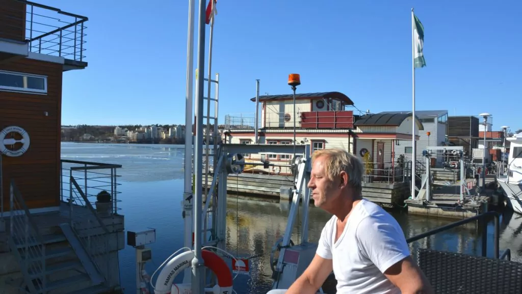
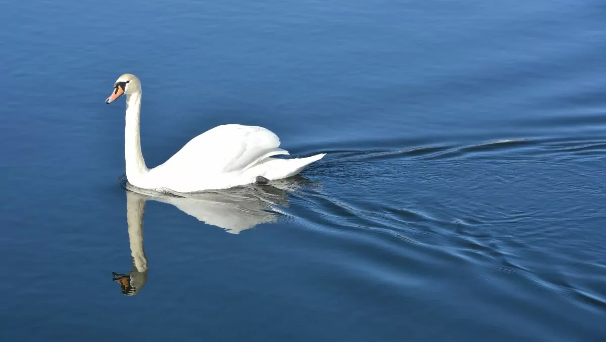
If you look at this blog post on a computer (or maybe an iPad?) you will see that the top image in the post (the swan) is very large. However, all the following images in the post (Peter on deck) are much smaller as they adjust to the width of the text. Although you can click on the image of Peter on deck to make it bigger, if you don't, it will appear much smaller than the top image.
Help us by voting!
Peter and I have different ideas about how big these images inside the post should be. Do you want to see them bigger from the start (without clicking on them) or is it fine as it is? And if you want to see them bigger, how How big do you want them to be? Just don't forget to vote as I (Helena) think! Haha, no I'm just kidding. We both want it to be good, so we really want to know what you think!






Mr Frank Olsen says:
Hmmm... on my PC (computer) the picture of the swan and the pictures on yesterday's post are the same size for example....
The picture of Peter gets a little too big when you click on it.
Also, you have to click on the "back arrow" in your browser to remove the Peter image again. That's not so good.
25 March 2017 - 8:34
Helena says:
Yes, it is true that today's top image and yesterday's top image are the same size. We have not changed anything! What we are wondering is whether the following images within each post (e.g. the image of Peter) should be displayed larger from the beginning (i.e. without clicking on them)...? Thank you for your feedback on how to get back when clicking on an image!
25 March 2017 - 8:48
Mr Frank Olsen says:
Yes I see it now that usually the pictures are smaller than the swan 🙂 .
But both Janne and I prefer big pictures, like the swan, but maybe it has something to do with age affecting our eyesight 😉 ?
25 March 2017 - 8:56
Helena says:
As it is now, we always have a first image that is extra large and then the following images are smaller. But some blogs have large images throughout... Nice! But sometimes you can also get lost in the context of too big images ... So yes, the question is whether we should leave the images inside the posts as they are ... or whether they should be bigger ...?
25 March 2017 - 12:01
Mr Steve says:
It is of course very individual how you want the pictures. I think too large images disturb the overall impression, so I choose not to use the large ones. Ideally, I can click on larger images if I want to.
It is wise to ask your readers for advice in this way when developing your blog.
25 March 2017 - 9:33
Helena says:
Thank you for your comment! Yes, we definitely want to hear what readers think! Especially since we have different opinions ourselves 😉 .
25 March 2017 - 12:02
Ama de casa says:
I think they are just right. Large images are TOO much (in some blogs they even overlap the text in the margin and overflow, like...).
If I want to study a picture closely (like the one of Peter which is very interesting 😉 ) I click on it. In WP you can also click twice to get an even bigger size. Just in case you are extra curious 😀.
25 March 2017 - 9:58
Helena says:
Haha, yes, it is possible to click when you want to study carefully 😉 Personally, I quite rarely click on pictures to make them bigger though, although of course there ARE times when you are extra curious 😉.
25 March 2017 - 12:03
SuperSonic says:
On my iPad, the swan is bigger. I think both sizes can work depending on what is more important? The image or the text about the image. If you consider the height of the image, the swan fills about 80% of the screen area on an iPad and the other image about 55% of the height. The width is about: 95% on the big one but it doesn't matter much as you don't have any text on the sides today.
25 March 2017 - 10:08
Helena says:
Thanks for the great comments! In a way it is nice to have big pictures. At the same time, you can sometimes lose the overall perspective. I agree that this could be due to ... but I don't think we can make the settings that way. Now we have a setting (encoding) that controls how big the top image is displayed and another that controls how the following images are displayed.
25 March 2017 - 12:07
Ruth in Virginia says:
The swan photo is a bit overwhelming. That's OK,
if it is the first and most important thing, i.e. telling you
about the post on that particular day.
25 March 2017 - 11:20
Helena says:
Thank you for your comment Ruth! Very interesting to hear what everyone thinks about this!
25 March 2017 - 12:07
Christian says:
I check on my mobile phone (an iPhone 7) and the pictures look the same - just right - size!
25 March 2017 - 12:02
Helena says:
Yes, exactly, in mobile phones it doesn't matter what we choose. There, all images are roughly the same size regardless. On a computer, however, there is a big difference between our large and small images ...
25 March 2017 - 12:04
Lennart says:
Between!
25 March 2017 - 12:23
Helena says:
Thank you for your comment!
25 March 2017 - 13:41
Ladies Abroad says:
I only have a mobile phone right now, but I agree that it's easy to lose context when images are too big. I really dislike full-width still images, where you can't see the whole image at once on the screen.
25 March 2017 - 13:08
Helena says:
I also find full-width portrait images tricky, when you have to scroll up and down and can't see the whole image at once ...
25 March 2017 - 13:42
Motorhome Helge says:
The swan is a good size if it is a question of a head on the blog otherwise it is too big we think. Peter is good in the iPad model. If you sit in HB with semi-foggy light, the image must not be too small because then the details are not so good. Do not know how it is in the computer as we have not used it for six months!
25 March 2017 - 13:11
Helena says:
Thank you for your comments!!! Yes, it is always a balance between being big enough to be visible, but not so big that you lose the integrity of the content...
25 March 2017 - 13:47
Cathinka - On the move! says:
I like it when the pictures in the post have the same width as the text as you have now. Agree with Lena about the problem with portrait images, that it is a scourge when you do not see the whole picture (especially when you love portrait images like me...).
25 March 2017 - 13:25
Helena says:
Yes, maybe it's best if they go edge to edge with the text? And when the text is way too wide, I think it's hard to read... although maybe you could widen both text and image a bit?
25 March 2017 - 16:38
Cattis says:
I am a fan of your current size of the pictures, the first picture can be bigger but then I like that the pictures are in line with the text because otherwise it will be easy for them to take over and the text will be overshadowed!:)
sv: Of course you spontaneously book a trip when you get it for half price!:P
25 March 2017 - 13:44
Helena says:
Thanks for the feedback! Eventually you become "blind" yourself, so it's great to get all the views!!!
25 March 2017 - 16:39
Goatfish says:
I think you have it perfect the way you have it 😀.
A large first image is OK, but the others are fine as they are. Too small is not good, you have to click and that takes unnecessary energy. And too big is overflowing.
😀 😀
25 March 2017 - 13:56
Helena says:
Thanks for the feedback! And I guess you don't think they are too small today?
25 March 2017 - 16:44
Lennart Nilsson says:
Good as it is. I think it looks best when the image is not wider than the text column. It is also important to make sure that the images are not too heavy to load.
Standing pictures are definitely best when you limit the height so that they can be narrower than the horizontal ones but slightly higher.
Lennart
Motorhome life.se
25 March 2017 - 14:30
Helena says:
Several people have written that it looks best when the image is not wider than the text column, so I listen to that! Thanks for the feedback!
25 March 2017 - 16:46
LinizTravel says:
Thinking like
Top picture ??? nice weekend! See you in 1.5 weeks longing!!! Kramae
25 March 2017 - 15:06
Helena says:
Thanks for the comment! Won't it be fun!!!? 🙂 ?
25 March 2017 - 16:46
Matts Torebring says:
The picture of the swan is fantastic. Still, I think Peter's contemplative image is big enough. If I want to see more, I click on the picture. It is fun travelling with you, you do everything so professionally.
25 March 2017 - 16:31
Helena says:
Glad you like the picture! The swan was fantastically nice and grateful to photograph when it slipped by 🙂 .
25 March 2017 - 17:21
Anki says:
The picture of the swan is great as here at the beginning of a post, but I think it is too big if it comes inside the post - then it fits better as you already have it - and usually you can click on an exciting picture in a larger format if you want.
25 March 2017 - 16:47
Helena says:
Thanks for the feedback!
25 March 2017 - 17:21
Husis blog says:
The owners think it should be like this post you made. The top and first image, which should capture the reader, should be slightly larger. When there are images in the running text, they should be within the frame so that the image is not larger than the text. Looks easily messy otherwise. These were the owners' views so it will be exciting to see what you decide.
I would also like to wish you a very nice weekend!
25 March 2017 - 16:47
Helena says:
Thank you for your comments! We will go through what everyone has written together, but it feels like many people think it may be too big with full size inside the posts. But we will wait for some more comments and then discuss...!
25 March 2017 - 17:23
Ditte says:
I think it's good as it is. If you have a poor connection, the very large images take an unnecessarily long time to upload.
And if I want bigger pictures, I just click. Works well.
25 March 2017 - 18:52
Helena says:
I upload the images in the same number of pixels whether they appear small or large, so I don't know if there is a difference in upload time. But maybe there will be?
25 March 2017 - 21:57
Emma, sun like sun? says:
I agree with the idea that images should not be too large at first glance. If I want to see better, I can make an active choice and click on the image. If you're out and about, it's a bit of a luxury when it takes too long to load.
Have a great weekend and don't work yourself to death! Don't forget to breathe.
25 March 2017 - 20:43
Helena says:
Thanks for the tip about not working ourselves to death! We may need to hear that sometimes! 😉
25 March 2017 - 21:59
Tia says:
The same dilemma here?...but some images are better in large format and then you hope that the reader also sees it? You definitely want to see the swan large so you can really feel how beautiful it is? Peter, on the other hand?...maybe it is enough that some pictures just speak for themselves or show in pictures what you have written but still do not take over...???? what a dilemma...?
25 March 2017 - 21:30
Helena says:
I agree that some images are better to see in large, while for others it doesn't matter. Then again, sometimes you may want to show several images in a post in large, and sometimes maybe none at all... 😉.
25 March 2017 - 22:01
BP says:
I think there should be a difference between the "main image" and the images inside the post. Just as it is now. With the size of the image with Peter being as wide as the text, it becomes airy with white space around it, which I like.
Your posts often contain quite long texts, so pictures that "break off" are actually appreciated. This together with an airy framing as now is perfect - I think so.
25 March 2017 - 21:30
Helena says:
Thanks for your feedback!!! 🙂
25 March 2017 - 22:02
Anette says:
I think it is mostly aesthetic as you have it now.
As well as a little more order when image and text get the same space. I also like that there is a little air around, otherwise it will be difficult to get an overview and as you write you can always click on an image that you want to look at more closely.
26 March 2017 - 3:45
Southern Ambition Africa says:
I would recommend the medium size or smaller. It's ok to have some varying sizes too if there is a common thread! I work with exploresaa.se which is based in Cape Town. We offer volunteer work, internships abroad and travel in Southern Africa. Take a look, you might get inspired! / Southern Ambition Africa
27 March 2017 - 15:41
Snows says:
Overly large images also interfere with my overall impression, so I actually prefer the smaller version.
27 March 2017 - 20:49