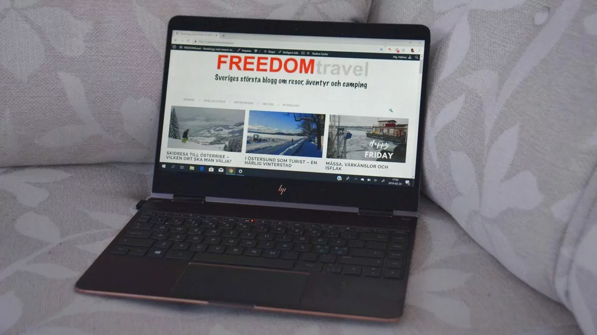
The new layout of FREEDOMtravel's homepage is finally ready. The idea is that it should be easier for you as a reader to find travel inspiration and reports, and that you should see more on the first page than just the latest posts. Perhaps it's not necessary, but we'll explain a little about our thinking!
Table of contents
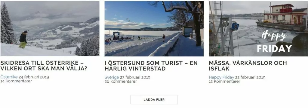
Latest posts at the top
At the top of the page are the three most recent posts. You will find the most recent (i.e. today's) post on the far left. If you want to read older posts, click on "load more".
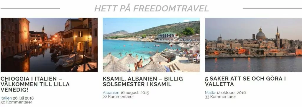
Hot on FREEDOMtravel
Just below the latest posts, we have added something called "Hot on FREEDOMtravel". Here we have the opportunity to add posts that we want to promote, or that we think are relevant.
Countries in Europe
Next is 'Countries in Europe', which are our country pages. If you click on any of these pages, you will find all the destinations we have written about in that country, from north to south, along with maps and links. We've also collected info and facts, films, "things you didn't know" and other bits and pieces. You can click on "Load more" to see more countries. And if the country you want to read about is not listed - it's because we haven't been there ...

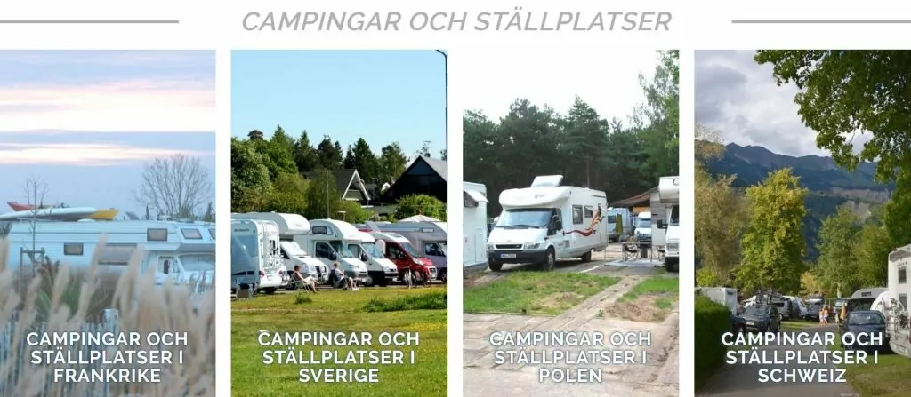
Campsites and pitches
After 'Countries in Europe' comes a series of pages on campsites and caravan parks. On these pages, we list campsites and caravan parks (that we have visited) from north to south, along with maps and links. At the bottom of the pages, we have collected information on driving rules, road tolls and more.
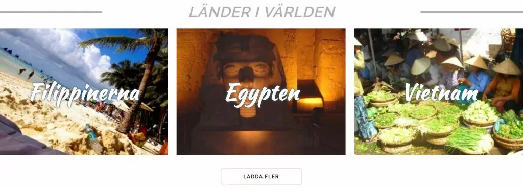
Countries in the world
At the bottom of the page we have collected countries outside Europe. Here too, you can click "load more". So far there are countries in Asia, Africa, North America and Oceania.
Do we want feedback?
So, yes and no to this question ... Of course. love we want to hear what you think! At the same time, we are in a situation where it is difficult for us to change much right now. We can't make these kinds of changes ourselves, so we've hired a coder. It wasn't cheap, and we can't afford to spend more money on this at the moment.
So ... while we welcome your feedback, we may not be able to make corrections right now. So... hope hope hope that you think it is little good anyway!






Mr Steve says:
I think the layout is great. If I was still travelling and needed inspiration and information, you would undoubtedly be at the top of my list.
26 February 2019 - 9:08
Helena says:
Thank you Steve! It's warming to hear! 🙂
26 February 2019 - 19:17
Anna, New York - My Bite of the Big Apple & Other Bites of the World says:
Very nice and clear! *Applauds*
I understand (know) that it is not cheap to fix endlessly. As I said, this is great. Go for it!
26 February 2019 - 9:30
Helena says:
Thank you Anna! So glad you like it! 🙂
26 February 2019 - 19:18
Deciree says:
At first I thought ... No how hard now you can't find anything.....But really it was great and good overview to be able to find and see what I just want to read about. Thumbs up 🙂
26 February 2019 - 10:42
Helena says:
I can understand that it's a bit confusing when it's new... Glad you like it anyway! 🙂
26 February 2019 - 19:18
Christian says:
Ambitious, well done!
26 February 2019 - 11:28
Helena says:
Glad you like it! 🙂
26 February 2019 - 19:19
Britt-Marie Lundgren says:
Very nice and clear!
You should be very happy with this layout!?
26 February 2019 - 13:40
Helena says:
Thank you Britt-Marie! Glad you like the layout! 🙂
26 February 2019 - 19:20
Solan says:
??????
26 February 2019 - 15:00
Helena says:
Thank you!!! 🙂
26 February 2019 - 19:20
Matts Torebring says:
You already know that you are professionals. That's great, isn't it? I give you five stars.
26 February 2019 - 18:15
Helena says:
Thank you so much Matts!!! 🙂
26 February 2019 - 19:20
Ama de casa says:
You are so incredibly ambitious with your blog and it turns out so well!
Although I have to admit that I was a bit confused at first when I saw the new layout, but I'm the one who is a bit anti-change. I like it when everything is as it has always been 😉.
On wordpress they come up with changes that "affect" me all the time and I get really annoyed. Why do they do this? Since only I get used to it, I have to admit that most things have become better.
Just to confess. (Don't tell Anders, he knows this for a long time but has never heard a confession 😉 ).
I think it looks super nice on your blog now! But damn it, don't do it again! 😉 😀
26 February 2019 - 19:06
Ama de casa says:
OK. I admit right away that when you do it again next time, I will get used to it again. Keep up the great work - congratulations!
26 February 2019 - 19:08
Lena - good for the soul says:
I think it turned out really well. Clear, concise and easy to find when you are looking for something.
Hug Lena
26 February 2019 - 21:03
Anette says:
Professional!
Readers are always a bit confused at first. Most of us are creatures of habit. However, it is easy to get used to something new for the better.
27 February 2019 - 3:17
BP says:
Like everyone else who has commented, I think that your changes were absolutely for the (even) better. You are really ambitious and high class. Praise there:-)
26 February 2019 - 21:12
Daniela | Discovering The Planet says:
Not surprisingly ;), I like this layout better. I was also a bit reluctant before I changed mine, but I quickly realised that readers can suddenly choose what they want to read. Against the time when we all had all the posts on the first page :)).
And that thing about spending money on the IT guy... mine gets everything I earn hahahaha.
26 February 2019 - 22:25
Mr Daniel Majak says:
Wow!!! You can see that you put a lot of time into your site ? ??
It looks great. ???
26 February 2019 - 23:16
JoY says:
You've done a great job of that. Clear and neat.
At first I thought: Oh How should I look now among all the "boxes"? You also gave info about it, so now I also understand, an 08 hihihi.
Hugs to you
27 February 2019 - 9:20
Maria / Magnolia Magis says:
It turned out great! 😉 Good luck! 😉
28 February 2019 - 20:20